Styles don't Define You - A Creative Tale with Michael Fugoso
Michael Fugoso, an artist, designer, and visionary seems to bring back an era of design that we might of hurried through, called, "skeuomorphic design", emerging in the early 2000's. Talking to him, he says this doesn't define him or his work. Looking at his portfolio its obvious he can't help being a master at it, evolving it to something were not expecting.
Just completing a branding project for the San Diego Airport, Michael talks to Digital Computer Arts on how to create a reputation for himself that is beyond deliverables, but more so along the lines of creating opportunity for clients (opportunities from creative idea that they would have never thought of) that involves script writing and art direction. Having worked as a Freelancer for companies such as General Mills, Adweek, Playboy, Salesforce, IBM, Playboy and GumGum, Michael tells DCA that he was first blown away by the idea that "you can do this, (illustration that is) for a living, and actually get paid". He is a strong case study that illustrators are more than image-makers, but through their craft evokes emotion. It's through this craft that employs the imagination to create the visual equivalent of a verbal idea. When illustrators pick up their pens, mouse or iPad there is much more that goes behind the scenes.
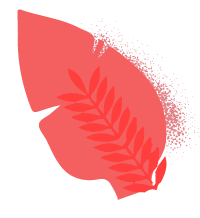
"Momentum is on my side", Michael says, "but it was a rough road getting here". He sits down and talks with us about his childhood and the ADHD label that was put on him at an early age. "I was never really good at anything, and I felt a lot (not all) of my classmates throughout kindergarten - 8th grade never took me seriously. A lot of my classmates in high school thought I was ‘high’ all the time, when to this day I can count the number of times I’ve been under the influence with one hand. It was a natural high I guess… or maybe I just space out all the time immersing myself in imagination." It is in his imagination that the Future Collection came to be and was the start of his particular look of "real" or a "natural interpretation of an object" - skeuomorphic design, something he is routinely commissioned for. He continues by noting that it is much more about the conversation with the client than it is giving them a desired "style" or look. "If the conceptual part is thought out and executed properly, it almost doesn't matter what style it is in. In some cases the flat and minimal path was the way to go." For creatives, one can always assume that finding a unique style is important, - talking to Michael, its obvious that its much more about the meaning behind the early sketches:

Starting off, was school or a person an influence during your early creative career? What was your childhood like, did you see creativity or desire to be in the "Arts" early on?
I was a difficult child growing up. A lot of my elementary school teachers had trouble keeping me focused, and I remember one of them recommending to my parents that I should have a medical check-up for ADHD in a parent-teacher meeting. I was never really good at anything, and my classmates never took me seriously. A lot of my classmates in highschool thought I was ‘high’ all the time, when to this day I can count the number of times I’ve been under the influence with one hand. It was a natural high I guess… or maybe I just space out all the time immersing myself in imagination.
I’ve always had a hard time explaining myself, or explaining complex thoughts in my head, and always felt like I needed some type of visual outlet, or visual aid to express what I’m thinking.
My older brother Paul was definitely the first, and the biggest inspiration that led to my passion of graphic arts. We were both into the same things: Transformers, Teenage Mutant Ninja Turtles, Bruce Lee, Dragon Ball Z, Fantastic Max… all kinds of early 90’s cartoons. My older brother was a natural at drawing, recreating our favorite cartoon characters in his style all with his trusty mechanical pencil. He hated .7mm lead… It had to be .5. So naturally, I needed .5 as well. As much as I tried to be as good as him… I couldn’t. He was just always amazing at it, being able to draw characters in all sorts of angles, while I was limited to drawing characters in a ¾ angle always pointing towards the right. I loved drawing… but I hated it too because creating things in all kinds of angles and variations just didn’t make a lot of sense to me.

The one thing that was a constant was that I always felt like I was in a state of proving myself. The one thing that I felt grabbed my peers respect more than anything else was my ability in the arts. They loved my ¾ angled character drawings! I would do fan-art, draw my friends into caricatures, and even do a little gangster style hand-lettering once in awhile. Sorry for this long winded-answer, but I feel like these experiences helped me to understand myself a lot better to this day. I’d much rather communicate visually than verbally… to show rather than to explain.
Also, the experience of limiting myself to drawing only ¾ angled characters probably lead to my appreciation of flat and minimal design today… I’m pretty sure I’ll have more of an opportunity to talk with you about this in another question :)

Have you always lived in San Diego? How have you experience the growth that California experienced?
Born and raised in San Diego! I never left because well… It’s a beautiful city and the weather is awesome. I have contemplated leaving, though about 5 years ago when I realized the massive value of experiencing living in different areas around the world, adopting more of a variable and adaptive lifestyle, rather than a fixed one.
I honestly don’t know if I’ve experienced the growth that California experienced. I hope this doesn’t sound too selfish or ignorant, but I think I was way more focused on the personal relationships with people around me. I can talk for days about how awesome my parents/family are, or how cool my friends can be… but I’m afraid my knowledge of California and how it has been over the years has escaped me. This probably wasn’t the answer you were looking for, but I have to be honest!
Hmm, I could say that everything is expensive here and that drives me to make money!
So this thing called creativity. How did you find it and how did you know you wanted to be in that space?
I’m thinking when I started to realize that creativity = doing, that’s when things really changed for me. I personally believe that creativity is simply a connection of multiple things you’ve seen in the past, and the more unexpected connections you make, the more creative your work tends to be. I could be completely wrong with this, but I can say that this state of mind helps me to not just constantly create, but to produce in a much quicker rate. It is exactly why we have things like creating boards on Pinterest, buckets in Dribbble, collections in Behance… we’re simply saving and categorizing these experiences or inspirations, and then creating visual connections between them that eventually become our own creative masterpieces.
I actually teach design at a local school here in San Diego, and one of the first things I tell my students is to purchase Austin Kleon’s book ‘Steal Like an Artist.’ It’s a $7 book on Amazon with a ton of pictures and diagrams that will help anyone get in the mindset of ‘doing.’ Obviously this way of thinking helps me to constantly produce on platforms like Instagram or Dribbble consistently. It taught me that frequency of work is an extremely important thing to go along with the quality of it all.
Again talking about your early career, can you talk to your first job? Was it in the creative space? how did it go?
My first ‘real’ job was at a bank, when then turned into a career of finance and real estate. Those years were hands down the worst years of my life. As I was pulling my hair out I decided on impulse to go to a local design school in San Diego called Platt College. This decision was based solely on the memory and idea that the only thing anyone appreciated me doing in the past had to do with art.
So then I signed up, buckled down for 2.5 years "to get that degree". I think it hit me after my first year… I loved this stuff and it was absolutely going to be the thing I was going to do until the day I die. For some reason everything clicked - I was no longer a B-/C student, and quickly moved to the top and graduated as valedictorian. Awesome entry-level design job opportunities came in and I’d say my most notable one would be my position as a marketing designer for the San Diego International Airport. At memory, it was an amazing job. Everything I’d work on I’d be able to see produced immediately to be utilized in the airport terminals. For this type of work, the best designs were the ones that communicated quicker, as often I would be designing things like terminal way-finding or massive wall-sized info-graphics. Because designs had the requirement to communicate fast, this is really where I honed in to flat and minimal design.
Another notable job I had was working for this candy company called Bee International. In this company we worked on candy packaging for companies like Hasbro, Crayola, and Nestle. It was in this job where I learned a lot of cool techniques like skeuomorphic design. I will say that this design style is more illustration-intensive.
The airport job was the one I had before I went completely freelance, and honestly if I followed the model that most people do, I would have been really comfortable staying there. It was a job that paid extremely well with a ton of room for growth… It was a job designed for me to retire when I’m 65, and I was honestly ready to do that… and then I started sharing my work on Instagram. Long story short, the awesome feedback from Instagram and Dribbble lead me to sustain a career in freelance, and gave me the courage and confidence in my work. I’d much rather have a career where I am in more control of my time and the content that I produce. One that allows me to travel and work at the same time and to basically enjoy more of an unorthodox and as I mentioned earlier, a more ‘variable’ life vs. a fixed one.
I’m not opposed to going back into the workforce though. If I do, it has to be for a company that I absolutely believe in and utilizes the skills and abilities that I am best at.

Based on your Portfolio, you do a lot of freelance work for both local clients and abroad. Can you talk about one of your latest clients or projects?
Absolutely! My favorite client right now is this technology company called GumGum Inc. My point of contact is this awesome guy named Bryan Bartlett, and what we basically do is work with other large companies like Best Buy and General Mills in utilizing this awesome tech that GumGum provides. Outside of this I have worked on a few article illustrations for companies like Salesforce, IBM and Adweek. I’ve also recently been added to Playboy’s roster of illustrators for article illustrations.
I have two other massive projects that I’m currently working on that unfortunately I cannot share at this time :( Be on the lookout though, follow me on Instagram or Dribbble as I’ll more than likely share on there when I am able to!


Your piece you did for a local San Diego surf film – an egg, seemly dazed and confused and rendered with such style. Can you elaborate your process with this piece and of course your process in starting an illustration.
Oh yes this was one of my favorite projects of all time, and a collaborative effort with my business parter Austin Faure! The name of the movie is called Sunny Side Up… so naturally I figured the sun is a very prominent figure in surf culture, and illustrating a sunny side up egg to represent the sun seemed like an awesome concept.
Probably the biggest figure in surf culture is the waves. My concept of an egg sunset in a perfect symmetrical visual piece would only work if we had the perfect photo of an A-frame wave horizon line. We teamed up with surf photographer Cameron Vurbeff for that perfect photo.
The egg illustration started off with a simple paper and pencil sketch. My sketches tend to be extremely simple, and sometimes not representative of the final rendered piece in Adobe illustrator. The main thing for me in sketches is to create the base shapes and to make sure composition makes sense before I spend the time putting in layers and layers of detail. In this case, the composition was for the egg yolk to be the strongest color representing the sun, and placed dead center on top of the A frame symmetrical wave horizon line.
Illustrating the egg completely in vector was not an easy task. As I was more familiar with illustrating industrial objects with metallic material, I had to do extensive study and problem solving with how light behaves on a more liquid object like an egg. Creating that perfect balance of hard and soft lighting to make the egg look believable was definitely the greatest challenge.

Your profile includes extraordinarily illustrations each unique for their purpose. You seem to be able to adapt to the needs and persona for each piece that you start. Is that intentional? Can you elaborate on how you start client onboarding, what is that discussion like?
One thing that I love about sharing work on social media platforms like Instagram and Dribbble is that it solves about half of the client onboarding process. Because of the established style(s), and the visual engagement each piece receives (likes, comments, etc), clients usually ask me to create their visual products in the same style or process. That itself feels like a huge weight lifted off my chest.
I have the mentality that I am more of a designer than an artist. For most of the content I produce, I usually have the restraint for client needs. I do extensive research, and usually hang out with a client at a bar and restaurant to gauge personality and to find out if we have similar interests. I do my best to capitalize on similar interests if they fit well with the client needs, that way the end result ends up being more playful and surprising in a good way.

Let’s talk the Fugstrator shop for a second. How did you go about creating it?
This one is simple! My store is simply a way for me to step away from the designer mentality, and to think more like an artist. Instead of thinking about what a user or client would want first, I would create the things that I think are cool and that I would absolutely love… and eventually find out if others feel the same way!
I think every creative should have a similar outlet. Creating for yourself once in a while opens up a lot of possibilities, things that wouldn’t even imagine if you’re always focused on client needs first.

Lets talk more about your pieces in the San Diego area such as the SR-71 piece.
The SR-71 piece is one of my favorites to this day, and was the very first project where I showcased the contrast between skeuomorphic and flat design using the same base shapes. My dad was always into aerospace for as long as I can remember, and was definitely a huge influence to me in starting this project.
I started creating skeuomorphic designs as a challenge from an old friend of mine. In a friendly way, he was criticising my work for being too minimal without a lot of variation. I took this as a way to challenge myself and to spend the time in illustrating hyper-realistic pieces. I’m actually a very technically challenged person, so problem solving the process for this was not an easy task. I ended up forming a very unconventional process combining simple shapes with blurs and gradients in Adobe Illustrator. Most Illustrators would use the gradient mesh tool to execute a lot of what I do… but the gradient mesh tool was simply one that was difficult for me to utilize and understand. In any case the blurry shape technique actually makes files a lot more difficult to manage, while also proving to be a lot for a capable computer to handle depending on the amount of detail.
There was one fan-art illustration I did on Optimus Prime (as I stated earlier, long time fan of Transformers here). For this specific piece I had to illustrate his head, body, arms and legs all in separate files because my computer wouldn’t be able to handle them all in one illustrator file. I hope I explained that difficulty properly, but in any case, I prefer the look on this technique over anything else in Illustrator, because it provides a unique soft and painted look to objects with dramatic lighting. I usually go through great and tedious lengths to achieve a certain look I’m going for, and I continue the process I’ve been going through because I believe the end result is a unique take on skeuomorphism.
I kind of went off tangent there, but that was the exact technique I used for creating the skeuomorphic version of the SR-71. The way those blurry shapes render lighting in illustrator turned out perfect for this jet. Putting the skeumorphic and minimal design badges side by side and displaying that contrast for the first time was probably when I had realized how far I’ve come in my understanding of lighting objects in illustration.
This actually started as spec work for San Diego Balboa Park’s Air and Space Museum. I understand that spec work, or any kind of ‘free work’ in this industry are frowned upon from my designer peers, but hey… I loved the project. I loved it so much that it didn’t feel like work for me at all; I just wanted to draw jet planes and space crafts! It is still a WIP to this day, and it probably won’t move forward with Balboa Park in the end, but for what this project did for me as far as recognition, and personal and social growth, you can’t really say it wasn’t worth it.

The shop has a unique aspect to it, in which each piece has a dedicated tone, representation and there are different mediums here, illustrations are represented as pins, posters, ect. What are your thoughts behind this? Is this all intentional?
I’ll be honest… there isn’t much thought here! I usually create an illustration, and figure to myself, this would be a great poster! Or this would be a great enamel pin! Sometimes I take complex illustrations I did in the past, and simplify them to work in a enamel pin mold. Sometimes I would take illustrations that were intended to be minimal, and add layers and layers of detail to them in the future. There really is no rhyme or reason to my storefront right now, and to be honest it’s not a huge focus for me at this time. Eventually I’d like it to take over, and when it does I’m pretty sure you’ll see products that are a bit more strategized and well thought out.
I am at this point right now though, where I believe if I were to continue with the shop there needs to be a unique and differentiating factor in the product line, other than the printed graphics of course.
There are a lot of designers with shops selling pins, shirts, and posters… this is not a bad thing at all, as I kind of alluded to earlier, the graphics and the art themselves can be enough of a differentiating factor. I just feel the need to challenge myself in being creative on the product production side as well. I do have some cool ideas that I know I can execute with minimal manufacturing costs, and I hope you all stay tuned for it!

Flat design, skeuomorphic design, can you touch on these styles? How much is your "defined" style accredited for earning contracts?
Oh I can go on for days on this, but I’ll try to keep this one simple. We absolutely need styles! Flat and minimal is obviously the trend right now, but I actually believe it’s more than a trend. It’s an evolution, and will continue to evolve with an infinite amount of possibilities. It’s communicative arts, and nothing communicates faster than minimal design! The execution is quick, and it is much easier to control design aspects like color and hierarchy. With this though I do believe there is a greater expectation for creative concepts and control of spacing.
With skeuomorphism, I believe everything is more difficult outside of the conceptual. Execution time is hours longer, color swaps are more of a hassle, and printing may not turn out the way you want it. That said, I don’t have to do much to keep it interesting, because the hyper-realistic detail is already providing enough of the wow-factor in most cases. If I were to make a Star Wars illustration on an X-Wing for example, and I chose the flat and minimal approach, I would have to place this X-Wing in some sort of creative composition to keep the piece interesting… otherwise it would just look like an X-Wing icon. If I were to take the skeuomorphic approach, all I would really have to do is recreate hyper-realistic details and in most cases I believe would get a very positive reception. You get that ‘ohh it looks so real’ feeling that provides an initial wow-factor.
If you can provide an amazing composition and the crazy amounts of hyper-realistic detail in one piece, it would seem ideal right? Well, not really… An amazing and creative composition is exactly what it is: An Amazing and Creative Composition. If the conceptual part is thought out and executed properly, it almost doesn’t matter what style it is in. Therefore you can say the flat and minimal path was the way to go, since those tend to communicate a lot faster. Not to mention execution time would be a lot shorter and you would get paid just as much for a project if you were to render it skeuomorphic!
In short, both styles will always be popular and will always be around. We need minimal design for communication, and skeuomorphism for that initial wow-factor. Obviously you can create wow-factor using flat and minimal design with an amazing composition, but hey... chances are you won’t hit that amazing and perfect composition all the time, and skeuomorphism would be a good way for you to provide quick wow-factor, and vary your illustrations a bit.

How have you seen them evolve?
Flat design is always evolving. First they were simply flat shapes, and then exaggerated lighting was implemented by creating 2 different tones of the same color. Then that evolved to simple gradients… then back to hard colors. Now we see a lot of flat design that has more emphasis on the line-work. Next, how about add grain textures to mimic shading and lighting. Flat and minimal design will continue to evolve because designers are essentially problem solvers. How do we take this complex object, and simplify it in a way that is recognizable. After that, how do we do this without being overly redundant?
Skeuomorphism always evolves as well. In my eyes, I see them more as promotional and powerful pieces, rather than visuals used to communicate quickly. For example, skeuomorphism isn’t really ideal for designing an interface. Something about buttons looking too real make them hard to differentiate from one another. As promotional pieces though, they can be extremely powerful. I see a lot of talented photoshop surreal artists coming up with amazing concepts. I don’t see a ton of vector Illustrators going skeuomorphic though, possibly because you simply can’t get a more realistic look than using a raster tool like Photoshop. This is pretty much a solution I’m trying to provide, to prove that you can make really awesome skeuomorphic pieces in illustrator using very simple blurring techniques.

What is in the future for Michael? Is there a company you would like to work for, or project you would like to work on?
You know what I don’t really look that far into the future. Once I finish one piece, or complete one project for a client, I simply move on to the next while being conscious on how much each projects helps me grow as a designer/illustrator. I strive for the right balance for me when it comes to artist and design work. There really is nothing like the feeling of knowing you kept your clients stoked or excited about their end product, and there is also nothing like the feeling of creating something for yourself and the unexpected outcome that may come out of it. My future is to go in the direction that exercises this balance in the best way possible.

Lastly you worked as a full-time employee, part time employee, and freelancer. What has been your favorite position and why?
Right now I am a freelancer. I can say for now I have enjoyed this position the most mainly because of the flexible schedule. I also get the opportunity to work with massive clients like IBM and General Mills. What I’m having difficulty in right now is scaling up, as it’s getting difficult to maintain a certain number of clients at once producing at the speed I produce. I am considering expanding the team and hiring out designers, but I’m not sure I’d want to go in the direction of starting an agency.
I would prefer not to work part-time… If I’d ever work for anyone I’d have to fully commit, as I don’t like to be in the ‘middle’ of anything usually. That said it may seem like it but I’m not opposed to being a full-time employee. It would just have to be for a company that I absolutely believe in, that also exercises a great balance of art and design. Sounds pretty vague right? I’m sure if the right opportunity would come for this, I’d instantly know it.

What can you tell someone that is just starting out in the creative industry?
Open-Mindedness is key. Be in a state of mind where you’re always learning, because your experiences can take you places you’d never thought you would go. Right now I’m putting efforts to learn 3D. Since I do a lot of skeuomorphic work, who knows, I might find a really cool process in cinema-4D!
Be a good person. It will go a long way with your clients, and it will go a long way with the people you are close to. Surround yourself with the right people. Stick around the ones that elevate you and be sure you do the same or them. Cut away all those that drag you down, or intentionally slow your progress. EX-girlfriends/boyfriends, poisonous old friends, sometimes even family members that don’t understand… Keep them away. You’ll need all the positivity and motivation you can get to help you create and constantly produce
Do not focus on gear, be more about content. Mac vs PC? Canon vs. Nikon? iPhone vs Android? WHO CARES. Pick the ones you think you’ll be most comfortable with, do it quickly and stick with them. They all do the same thing, and if one is actually better than the other, it’s extremely minimal compared to the time you waste not creating anything
Limit going out. You don’t have to go out every night and kill your brain cells with alcohol. Heck you don’t even have to go out every weekend. You have to get stuff done, you just have to. Limiting going out will save you a lot of money, save your health, and have you focus on the things that really matter.
Don’t talk crap. I’m guilty of this sometimes… but really, it does not get you anywhere. If anything it slows you down, and eventually you become the crap you talk.
Stop making excuses! You either did it or you didn’t. Most people can see right through you from a mile away, and if they believe you then you’re just leading them down the wrong path.
Don’t be afraid of business. Develop business skills, there are plenty of opportunity for designers to make money. If you refuse the business side you’re just making things 10x harder for yourself.
KEEP CREATING CONTENT. Whether for yourself as an artist, for others as a designer… the more you frequently create your quality of work gets better and better, and eventually you will create your style.